
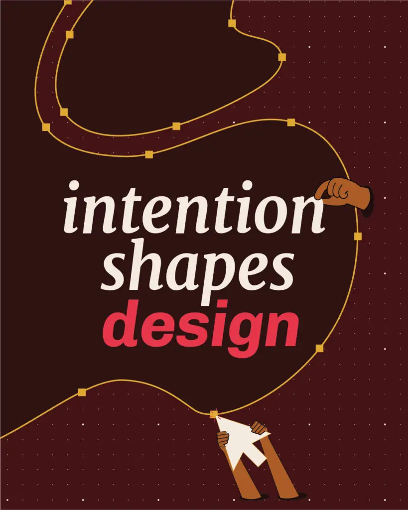
With the elements of our visual expression fully redefined, our next opportunity was to apply it consistently across our website. Often, people put a lot of weight on creating a logo and choosing their unique colors and typography, but these are really the beginning steps of bringing a brand to life. Adding a logo to a letterhead or posting it as a social media profile is a good start, but the hard, and the most crucial, part is building a world around your identity.
Until your brand fully comes to life through a world of consistent visuals that look and feel like your brand’s authentic personality, it will be harder to be remembered and trusted. Just think of one of your favorite brands. Can you tell whether a commercial or ad is produced by them even if their name or logo isn’t displayed? If so, it’s because their brand has fully come to life and effectively communicates their personality through other elements.
Creating this type of consistency requires commitment in ensuring that every touchpoint, whether through a website, report, marketing collateral or even an in-person meeting, expresses your brand personality through visuals.
This post dives into how we brought our brand’s personality to life across our redesigned website. This is where we got to create an environment for our audience to “step into.” As you’ll discover, for our studio nothing is purely decorative or superfluous. All design has a purpose and is meant to communicate meaning.
Expressing Our Brand Persona’s Depth
To express our brand’s depth and flexibility, we began expanding our visual identity into additional elements such as repeating forms, texture, photography, icons, and illustration. For us, this is where it gets fun. This is where our style guide became reality. Each element serves a purpose and expresses our unique voice, tone, and style. So even when our logo isn’t present, it reads as ours.
Talooka Studio: Warm, Curious, and Self-Assured
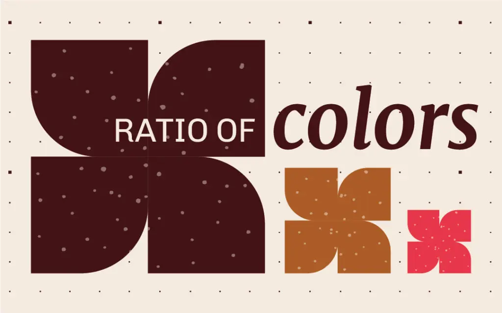
Staying true to our brand’s tone of “warm, curious, and self-assured,” we used a ratio of colors that allowed us to express these vibes. Maroon is our primary color, since it conveys a warm and inviting feeling. Watermelon red speaks to our curious side, and tan communicates our trustworthy, grounded, and self-assured tone.
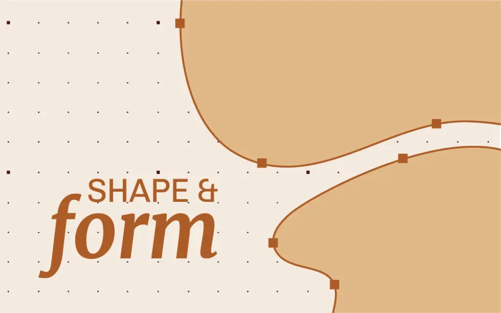
Another element that embodies the warmth we want to exude in our branding is the use of organic shapes. We felt these types of shapes lend a human touch, as opposed to sharper, geometric patterns. The type of shape we landed on was a blob (yes, that’s the technical term), inspired by our site tagline, “Where intention shapes identity.” The idea is that the blob represents an original idea or intention, which is the spark for creating something new.
A Delicate Balance of Expression and Structure
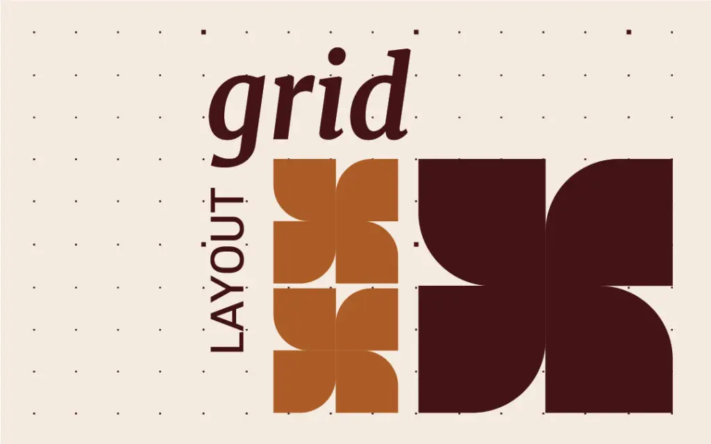
You’ll also see grid motifs as background elements throughout the site, especially on the pages showcasing our work.We deliberately chose the grid as a subtle background because structure is always present in the way we provide our services. It’s where intention becomes precision. Together, the blob and the grid represent the balance between an idea and the structure needed for execution in the way we work and what we create.
Photography vs. Icons
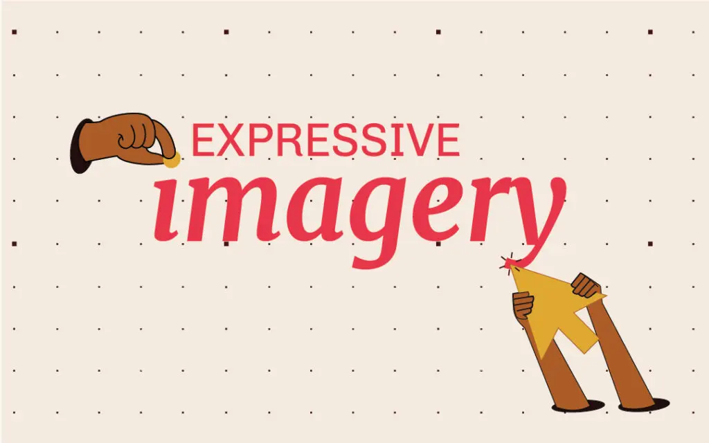
Along with the intention behind our other design choices, our decision to use icons instead of stock photography also had a reason. Although we still needed a human presence, we wanted our portfolio to hold the primary attention. So, we decided to use icons to illustrate and support the site’s story. They’re functional visuals that carry meaning one layer deeper than the words we put next to them.
Every color, blob, grid or icon has a purpose on our site, beyond adding decorative value. They all work together to add visual appeal, but more importantly, they all create a world where our brand’s personality is consistently expressed and credibly brought to life.
Equipped with this insight, you’ll probably experience our website, and others you come across, in an entirely new light. You’ll start to notice whether the design elements communicate a consistent “look and feel,” and how that helps you develop a relationship with a brand.
Coming Full Circle
From the very start of our rebranding process where we clarified our values, broader purpose, and vision, to our last steps of repainting our digital storefront, we’ve taken you through our rebranding process. Today, we are clear and confident around our vision and direction, and our brand feels more aligned with us as people and as a studio.
Building a brand world takes curiosity, clarity, and a whole lot of intention. Thankfully, those are our favorite kinds of projects. So, if your brand is evolving too, we hope this gives you a few ideas, and maybe even permission to think bigger than a logo.
