As we continue sharing our story of how we redefined our brand, we’ll turn next to the work we did to revisit our tone and voice.
This work is so important for any organization, because tone is an expression of a brand’s personality. It influences how its clients, customers, and key stakeholders perceive and interact with it. For example, if your brand’s tone is fun and casual, that will resonate with some audiences more than others. The same is true if your brand is more serious or reserved.
We’ll walk you through the two key steps we took to clarify our unique tone, which put us in an empowered position to inform our visual brand.
Moodboards: Expressing Our Emotional Direction
How did we discover Talooka Studio’s unique tone? We started with a thoughtful next step that felt right for us. We turned to moodboards
Moodboards are curated collections of visual elements, like images, colors, typography, textures, and patterns assembled to express the overall vibe or emotional direction of a brand.
We gave ourselves a week to reflect on our own personal style preferences and discuss what we’re drawn to. The goal was to make sure that we intentionally considered all the pieces as we moved forward.
We presented our boards to each other and talked about our preferences for type, color, pattern and illustration. Then we compared the feelings and tones we personally live in and how that emerges in the work we consistently do for clients.
Now, something that’s not well-known outside the design community: it’s notoriously difficult for designers to brand themselves. Especially when there’s more than one designer and they aren’t stylistically matched. The same can be true for a larger organization made up of many people who are trying to figure out how they can express themselves as one unified brand, yet remain true to the unique people who make up the organization.
Moodboards helped us get everything out on the table so that we could systematically go about tackling this challenge.
Once we presented our moodboards to each other, we asked these questions:
- What is consistent?
- What can we discard?
- What tensions exist that need to be addressed?
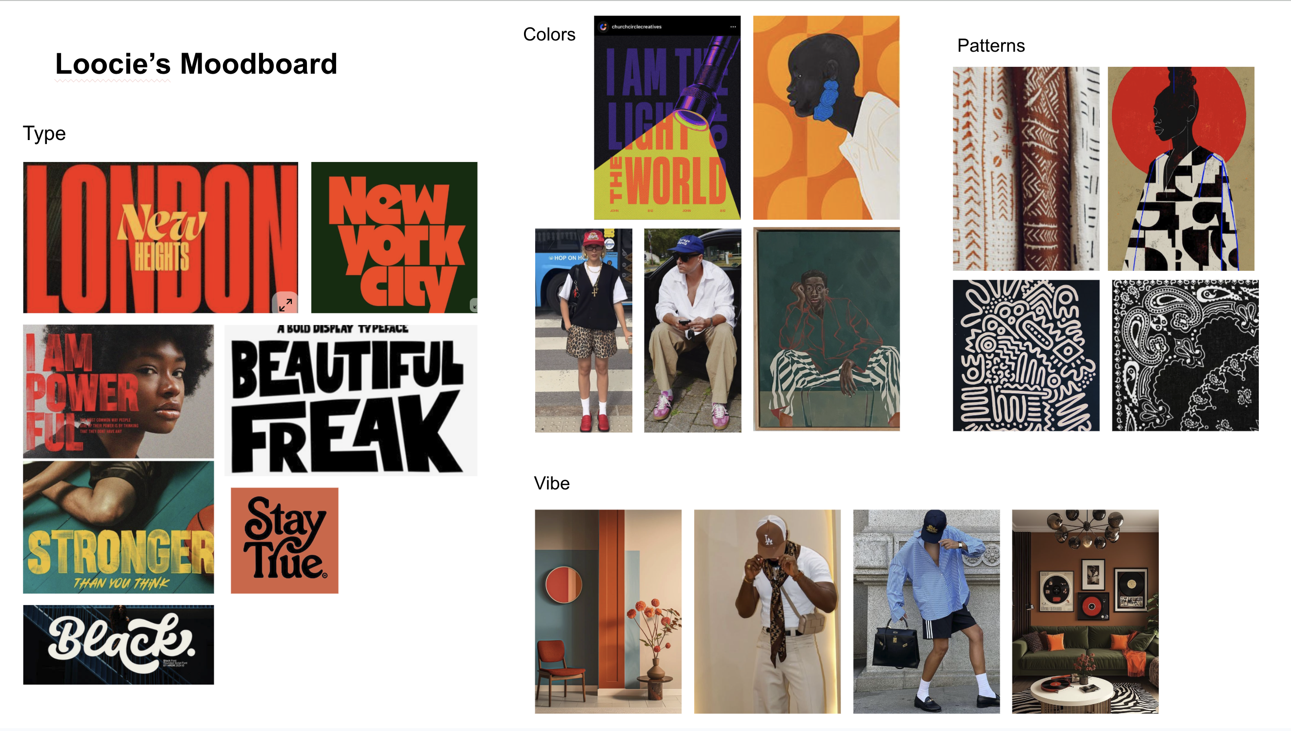
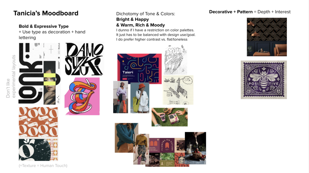
A few common elements surfaced across our boards. We both were drawn to bold type and strong color, but there were also subtle differences. After quite a few rounds of revision, we were ready to move on to articulating our tone of voice: our Tone Trio.
Words That Matter
A tone trio is a set of three words that shapes the personality and voice of a brand. After we completed our moodboards, we then brainstormed different words that our visual elements translated to. The tone trio we landed on was “warm, curious and self-assured.” These words matter a great deal, because they represent our brand personality and also describe how we work and interact with clients.
If our brand were a person, the tone trio would influence how we communicate and present ourselves, both in our visuals and in our messaging.
Why did we intentionally choose “warm, curious, and self-assured”?
These words add a human element to our brand. As much as we can, we want design to feel inviting and convey the sense that, “humans live here.” Curiosity comes across in the details of interest. The things that move your eyes across a page or express curiosity without devolving into chaos. Our design always has a sense of self-assuredness, focus on balance and a strong presence. We lend these qualities to our studio work and wanted it to come across in our studio branding.
Ordering Our Words
In a tone trio, the order matters. It tells us what is holding weight and what to prioritize. It applies to visuals and also to the broader messaging of a brand.
- Warmth reminds us to be inviting, and that relationships are important to us. And although we work remotely, our digital spaces (zoom, website, social media) are spaces that we can treat like our office, welcoming you to stay a while.
- Curiosity is how we approach our workshops and consultations: thoughtful and open. From day one, we’ve been interested in allowing others to be their authentic selves and want to know how they want to be perceived, rather than telling them who we think they should be. In that way, we honor their unique identity.
- Self-assurance is something we all have to work towards. We definitely know what imposter syndrome feels like. But, identity is our business and we know who we are and what we have to offer. We’re quietly bold. We’ve discovered that once you are confident in your values and what you stand for, you don’t have to be the loudest one in the room to make a statement people will notice.
Once we found our Tone Trio, we were equipped with the tools we needed to go back and take a critical look at our visual brand to take it to the next level of evolution.
Why Taking the Time to Determine Tone Matters
Going through this thoughtful, intentional, (and fun!) process was so valuable because it gave us a depth to our visual identity that we hadn’t had before. It allowed us to express in both words and color, who we truly are, individually and together. And it gave us the critical building blocks to inform the refresh we needed for our visual brand.
Now, take a moment to think about your brand’s personality. Does your current tone actually reflect who you are?