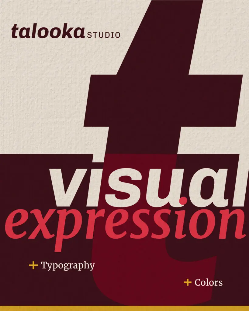
Finally, after months of conversations, research, and multiple drafts, we were ready to refresh the “look and feel” of our brand: our visual expression! As a design studio, of course, this is what we live for. Yes, at long last, it was time to update our logo, colors, and typography.
You’ll notice that this step came after we had clarified our values, vision, and tone–and intentionally so. As we walk you through our new visual identity, you’ll see that the deep strategy work we did leading up to this laid the foundation for us to be able to make intentional changes aligned with where our brand is today.
When we do this for clients, we guide them through a deep-dive, strategic process to better understand their vision, positioning, and brand. Applying this process to ourselves, we had to revisit what we had unearthed in our conversations about our vision, tone, ethos and design philosophy. We looked at what we had discovered about how our brand had evolved and asked ourselves how those discoveries influenced how we present ourselves.
The Strategy Behind a Logo
The first question we had was whether to keep or reimagine our logo. We had used our original monogram mark for 8 years, but realized we wanted to be known for our full name “Talooka,” and not by our initials “TLK.” Once we confirmed that, we quickly decided we weren’t going to move forward with it, but it took us a few weeks to accept that decision.
Why did it take a few weeks? We were emotionally attached to our older logo, because for us it had sentimental value. It was connected to our experience of starting our own business and building something new. But strategically, it didn’t serve our goal of gaining more name recognition. We felt it just confused things.
Do we still use “TLK” as a short hand? Sure. Does everyone else need to know or use our short hand? No. It’s just not something we wanted to enforce. Our refreshed logo, on the other hand, clearly presents our brand’s name in a way that makes it easier for people to know and remember us.
Purpose in Color
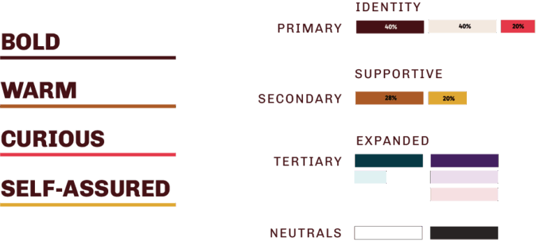
Second, we remixed our color palette, keeping in mind our newly defined tone trio: “warm, curious, and self-assured.” We’d had “watermelon red” for just as long as the monogram, but it no longer fit. It was too brash of a color for us, and it could lean too playful or too aggressive. Our evolved brand is now calmer and focused on the warmth of our space.
Because of this, we chose a burgundy for our primary color that is warm, strong, and fits our emotional tone better. We still kept the “watermelon red,” but moved it down the color palette hierarchy. Now, when we use it, it’s in smaller amounts, as a pop of positive energy.
We also expanded the palette with tans and jewel tones that felt rich and deep. Each color expresses a part of our brand personality and better reflects our identity today.
A Touch of Typography
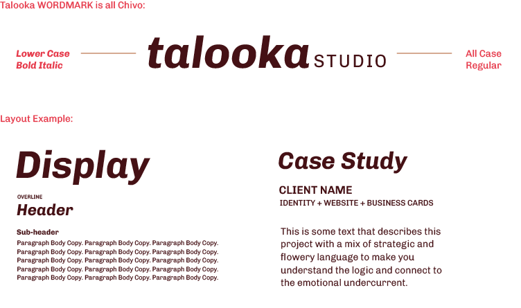
Last, we explored new typography. The challenging, yet interesting thing about the elements of a visual brand is that they need to stand on their own while also working together without stepping on each other’s toes. Also, there’s so much that goes into focusing on the forms and the way letters make a word feel. It’s like the way a person’s accent can make a simple word sound beautiful or confusing.
Considering these factors, our tone-trio guided our direction. We chose the font Chivo because it feels strong and exudes our self-assured tone. It allowed us to make “Talooka” lowercase in our wordmark, since we have a casual way about us. It also isn’t a traditional-looking serif and has a little more character and playfulness than most sans serifs. Just enough to touch the last tone of our trio, “Curious.”
Each of these changes were small on their own, but together they aligned our visual identity with the new tone we had defined.
Culminating in Clarity
As identity designers, expression is our favorite part of the process. We relish the satisfaction of digging into an organization’s positioning and their goals to create meaning that informs our design decisions. The result?
The process of visual expression culminates in creating a clear, distinct face for what might otherwise be a vague voice in the back of your mind. That’s our goal. And that’s what you need for all of your hard work behind the scenes to come to fruition, especially in the way your audience sees you.
Our clients tell us that the feeling of having a visual identity that authentically reflects what their brand stands for and everything they’ve built is transformative. It’s like reaching the crest of a hill and finally seeing what’s ahead—clear, expansive, full of possibility.
There’s a sense of excitement, but also ownership. Because it’s not just any path forward—it’s one that feels entirely their own.
So the next time you take a look at your logo, ask yourself: What does it reflect? Does it represent where you are and where you want to go?